Sunday, May 2, 2010

Little Things, Big Picture

This post is dedicated to a few ads that display the theme of little things coming together to make something bigger and more meaningful. Whether it be little ideas, little images, or little words, when they unite, they become infinitely more impacting.

1. BBDO (Germany). Mercedes-Benz. This is from a recent campaign for the new "danger-detecting" model. It takes a simple sentence that most everyone sees or hears and turns it into something more powerful - a warning of a danger that might be faced. I like this campaign because it reminds you that accidents can happen everyday and without warning, usually when you are doing simple driving tasks. It  gives you an example of why the danger-detecting software would be useful, almost invaluable. It took something simple (small) and turned it into something bigger.

2. Saatchi & Saatchi (Singapore). ESPN. I like this one a lot. Sometimes we never stop to think about all the little details and movements involved in a simple sports wave. The entire performance depends on the accuracy and awareness of each individual participant. If one is off, or refuses to leave the seat and enter into this right of passage, the whole thing is ruined. The ad makes the wave even more epic, inspiring even. Little details, big picture.
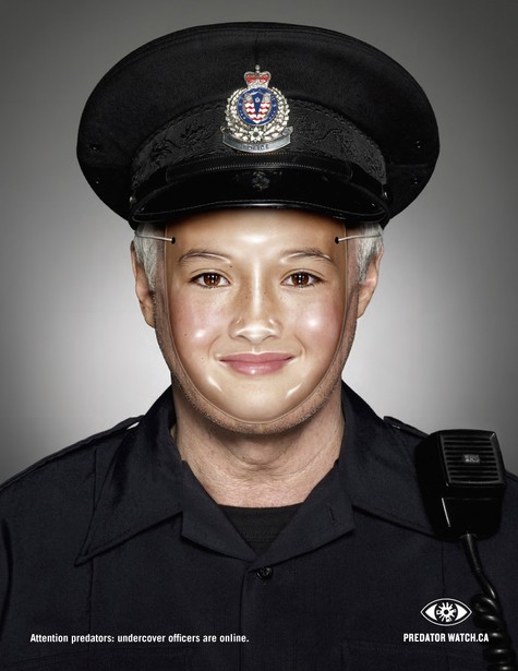
3. 

TBWA (NYC). Sony Bravia. Of course, I had to include this campaign in my post - it's a great example of the theme I am trying to describe. All the little bouncy balls are meant to represent all the little pixels of color that come together to create the brilliant display that is a Sony Bravia LCD TV screen. This ad is so beautiful and transfers the idea of beauty to the product. By focusing on the small parts that make up the TV screen, instead of the screen itself, Sony Bravia was able to separate itself from other TV ads and create an eloquent yet good-humored personality for its product - not to mention that it is a pleasure to watch.

Overall, breaking down something large can help you find the nugget of information that you are looking for in a campaign. Sometimes we tend to get caught up in the finished product and lose sight of the details that got us there. We forget that the small things are what are truly important. Where would the products be without them?

Thursday, April 29, 2010

Modernista!

Names that include punctuation are almost as cool as those who refuse it.

Headquarters: Boston, Massachusetts. With other offices in Detroit and Amsterdam. Modernista was founded in 2000 by Gary Koepke.

Current clients: Hearts On Fire, General Motors' Hummer, and Cadillac, Product Red, and Stop Handgun Violence. They have done work for the likes of Converse, MTV, Napster, Gap, and Anheuser-Busch.

Modernista! (Boston). Napster is a file-sharing program that basically allows you to download music from their online database for cheap. Cheaper than iTunes, cheap. Everyone shares their music with each other like a musical commune. This ad totally captures the purpose of Napster and portrays its edgy, anti-establishment personality. The headline line is fabulously simple, and pounds the message into your head: don't buy music, share it. Of course, the original company shut down due to copyright issues (who didn't see that coming?). Now, the service still exists but you have to pay a small monthly fee for access to the music database. All in all, the original message reigns on. Do your own thing, forget the rules, get the music you want now.

R/GA

Founded in 1977, R/GA is a global ad agency that is headquartered in NYC, with other offices in San Francisco and London. It is a part of the Interpublic holding company.

It noted for its great digital and visual production capabilities.

Work: Nike+, Droid, Noke viNe, Zain Retail Experience, Ad Council's That's Not Cool.


R/GA (NYC). This is one of the many videos made for their work for Ad Council to support an initiative to make teens and parents more aware of cyper-bullying and cyper sexual-assault ("sexting"). I think this whole concept is cool because they collaborated with actually teens to create the material on the site. By providing information for kids, by kids, they made an environment that is safe, inviting, and informative. The site offers tons of info about how to know if you are being attacked, who to talk to, and how to stop it. Empowering kids through material thought up by kids. Awesome.

www.thatsnotcool.com

Secret Weapon Marketing

Where, you guessed it, they are the secret weapon.

Past Clients: Nissan, Infiniti, Jack in the Box, Carl's Jr., Taco Bell, Dyer's, Nike, Energizer, Coca-Cola, Alaska Airlines, American Express, Reebok, and ABC Networks.

They only have three clients at a time, so they can focus all of their energy on those clients only. I think that's pretty neat.


Secret Weapon Marketing (CA). This campaign goes right for the problem: people don't trust car-salesmen. It's a universal truth. So why not be honest about how awful they are and show why Honda sales-people are different? This series is cute, honest, and approachable. Making you truly feel like you can trust Hondas and the men and women who sell them. I'll have to admit, though, that I find them a bit too corny for my liking, but overall, cute concept and good message.

David&Goliath

David&Goliath is a full-service indie agency. They have offices in Los Angeles, London, and Frankfurt. They started their own non-profit organization called the Brave Alliance. They also have their own in-house print production studio (Bullseye) and broadcast production studio (Spinach).

David&Goliath (LA). For Mammoth Ski Resort. This ad grabbed my attention because it has many of the same elements of the VW work by DDB. Small image, big white space. What's kind of ironic, is that instead of "Think Small", their tagline is "Play Big". Simplicity in my mind is always best. Also, I don't know if you have ever been to a ski resort, but they are always packed! So this simple image of a lone skier with all the room in the world to carve through is not only impressive but mouth-watering. I would love to have a whole mountain to myself. Of course, I understand that this sentiment is not the message, just wishful thinking on my part. Overall, this ad doesn't overwhelm you with detail and color and people and prices. Instead, it wraps you in a sense of beautiful isolation and makes you yearn for your turn to carve some powder.

Wednesday, April 28, 2010

Ground Zero

The agency was started in a 10'x14' room above a restaurant in Venice. One of their founders wrote the movie Old School and a children's book published by Random House. They are the first agency to get a TV commercial exhibited at the Metropolitan Museum of Art. And it is only 15 years old...

Clients: 2K Video Games, Bit-O-Luv Dog Treats, CA Department of Health, Ditech, ESPN, Mylife.com, Oberto Beef Jerky, Pinky Vodka, Parrot Technologies, and Mercury Insurance. Have done work in the past for the History Channel.

Ground Zero (Los Angeles). For ESPN. This is a direct mailer that was sent out the exact same day that Boston Red Sox traded a prominent players to LA. ESPN needed to capitalize on the trade and do it immediately. This is a great example of quick-thinking in an appropriate manner. The note presents a snarky jab at Boston, fitting the sentiments of the situation dead-on. It also is easily understood, the message is delivered almost instantly. Not to mention that it is move that would definitely get press and a whole bunch of word-of-mouth. Home run.

Tuesday, April 27, 2010

Rethink

HQ: Vancouver. With offices in British Columbia and Toronto. Yay, Canada!

They currently employ 60 people... which sounds kind of small to me, but hey, if it works.

T'was founded in 1999, by Chris Staples, Ian Grais (definitely French-Canadian), and Tom Shepansky who all used to work at DDB Vancouver.

Clients: A&W, the British Columbia Automobile Association, Sobey's, Mr. Lube, and Science World at TELUS World of Science.

They are most famous for their work for PLAYLAND.

Rethink (Vancouver?). For Children of the Street Society's launch of Predator Watch. Copy: Attention predators: undercover officers are online. I think it's kind of ironic because we usually see ads that focus on warning children and their families of the threat of online predators, but in this campaign, the cops are warning the predators. Also, it shows cops pretending to be kids instead of the predators pretending to be kids (which they often do to lure in unsuspecting children). Once again, it is an example of turning a topic on its head and approaching it from a different angle. Not too mention that it's way creepy.